A landing page that converts is not about pretty visuals but about clarity, relevance, and frictionless decision-making. Users give you only seconds to understand why your offer matters, so every element must guide them toward one action: converting. Here is a concise, practical breakdown of what actually works.
Contents
Start With a Value Proposition That Hits Immediately
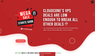
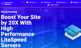
Most landing pages fail because the hero section is vague or overloaded. Your value proposition must instantly answer three things: what the offer is, who it is for, and why it matters. Use a headline focused on the outcome rather than the product. Support it with one short line and add a clear, singular CTA. Avoid generic claims and lead with specifics like performance gains or real advantages. If you promote technical services such as Host-World VPS Hosting, highlight the core benefit upfront, whether it is speed, reliability, or customization.
Reduce Cognitive Load With Simple, Predictable Structure
High-converting pages rely on clean hierarchy. Break the content into obvious blocks that users can scan effortlessly: features, benefits, social proof, FAQs, pricing, and a final CTA. People skim pages in predictable reading patterns, so place the most important information where the eye naturally travels. Keep paragraphs short, use bullet points when helpful, and maintain generous spacing. Stick to one main action. Multiple competing CTAs confuse visitors and hurt conversions.
Build Trust With Proof, Not Promises
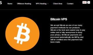
Modern users do not believe slogans, they believe evidence. Add testimonials that show real outcomes, not vague praise. Display recognizable brand logos, case studies, or usage numbers to reinforce authority. Certifications, success metrics, and transparent service-level details help reduce hesitation. For technical products, consider adding uptime data, performance benchmarks, or clear feature comparisons. Trust elements should appear early on the page, not buried at the bottom.
Remove Friction From the Conversion Process
A streamlined conversion process is essential. Keep forms as short as possible. Only ask for information you truly need. Replace long dropdowns with smart defaults to minimize effort. Offer more than one contact or purchase method so different user types can choose what feels easiest. Improve loading time by compressing images and avoiding heavy scripts because even a small delay can significantly reduce conversions. Repeat the main CTA in strategic places, but avoid overstuffing the page.
Use Visuals That Explain, Not Decorate
Images and graphics should increase comprehension. Use diagrams, product mockups, dashboards, or workflow illustrations that help users understand how the solution works. Avoid generic stock photos because they weaken trust. Choose visuals that reinforce the value proposition and guide attention toward the CTA. Clarity always beats decoration.
Test One Change at a Time to Improve Conversions
Conversion optimization is a continuous process. A/B test headlines, CTAs, layouts, and proof placement to see what actually lifts results. Do not test too many variables at once because you lose the ability to identify what caused the change. Use heatmaps and session recordings to analyze user behavior and adjust weak sections. Small, steady improvements compound into significant gains over time.